
RESEARCH & REFLECTIONS
Soil
Self & Space
My practice has always grown through an evolving understanding of what it means to consider something as home. I am drawn to an intimate exploration of space, not only as a place inhabited, but as a living archive of matter and memory.
Central to this inquiry is a deep engagement with pigment: sourced from the minerals, soils, and elemental substances found within the environments I move through and dwell in, each material carrying the quiet history of the ground it came from.
Space, in my practice, is never neutral. Each environment I enter becomes a site of inquiry, something to be read through its surfaces, its sediment, its residue of human and geological time. I am drawn to the way a place holds memory not in its grandeur but in its overlooked matter and by gathering these substances as both material and meaning, I let the pigments I make from them carry forward what the eye might pass over.
'Space, indeed, is not merely the separation of objects in the world, but is rather a bundle of trajectories' (Massey D, 2005)

studio diary notes
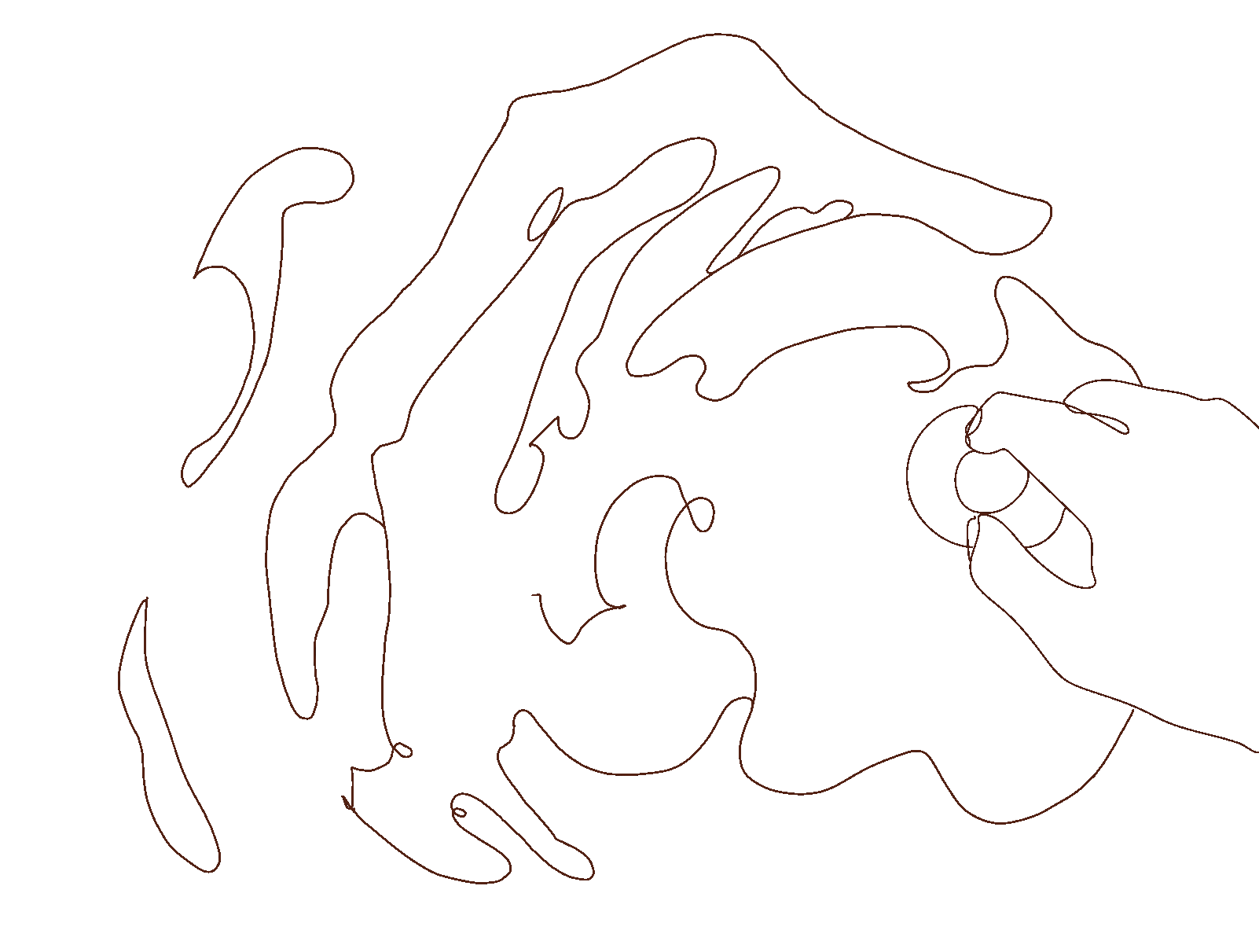
This understanding reshaped how I perceived things around me. I began to see spaces, filled or empty, not as a fixed static area, but as a product of human existence, layered with perception, memory, and emotion. Every space, no matter how ordinary, began to feel alive. I started noticing small, often overlooked spaces, and began drawing them, imagining my own thoughts alongside how others might have experienced them, how someone once existed there, how emotions accumulated and overlapped, leaving traces.I began to be drawn to the negataive spaces that existed between objects,often sketching them, trying to understand the emotion in them. Space began to feel layered, intimate, and fragile. And yet, in these spaces, I often wondered, where should I even look?
On spaces
While living and moving houses in London, I began to feel the emotional weight of spaces in a very personal way. The place I left behind had once been inhabited by someone else, carrying their memories, dreams, and joys. Spaces began to feel like these cages of layered histories with each person overlapping the other. Yet a room could also be intimate, a space of comfort, a feeling of home even in a new city.
This layered quality of spaces reminded me of LN Tallur's work, Inference (2019), a slow-motion video capturing the cleaning of a rug originally installed in a palace in Junagadh,India produced in the late 1800s during the era of kings and British colonial rule. The beating of the textile released clouds of dust, enveloping the scene and the workers, revealing layers of time and memory embedded in the surface. The dust was a trace of generations of the kings and people who once lived there, the echoes of a palace tthat remained untouched for so many years, and now filled the air.
The work resonated with my own experience of inhabiting rooms and migrating people in them which holded sedimented histories, where memory and human presence were persistant in subtle, almost intangible layers.

initial ideas in studio diary

Interference, 2019, Artist LN Tallur, image cortesy: gallerychemould.com
Building on these thoughts, the writings of anthropologist Setha M. Low helped me understand the deeper dimensions of space and belonging. She writes about how the house is not just a shelter but a cultural object, a place that holds memory, identity, and history within its walls. The idea of the “sweetness of home” she describes is something I found myself relating to and how comfort and belonging are tied to class, culture, and the material things that quietly shape our lives. The way a home is built, the furniture inside it, even the smallest details, all these carry the intimacy and protection we associate with feeling at home.
Low also speaks about how space is embodied, how our bodies move through and experience the world, and how belonging changes when we move between places. The idea of multilocality, being connected to more than one place at once felt close to what I had been feeling after moving to London. Spaces like airports or train stations, what she calls “non-places,” became part of my life too, where movement and waiting seem to hold a strange in-between feeling, neither belonging nor leaving. Through her writing, I began to realise that space is never neutral. 'It holds memory, stories, and social meaning; it lives through us and the way we inhabit it.'(Low & Lawrence-Zuniga, 2003).
Reading her work also made me think of the performances of Thierry Mandon, a French artist who often stages quiet, almost meditative actions in abandoned or transitional spaces. Performances where he repeats ordinary gestures like reading, cleaning, or sitting still reveal how space itself carries emotion and time, and how the presence of different people inhabiting the same space over time creates layers of feeling, bedding one on top of another like fine layers of paint, thickening the emotions as they overlap. I found a deep connection between his approach and my own reflections on place: how stillness, repetition, and presence can transform even forgotten or ordinary spaces into sites of memory and contemplation.

Inside- Outside,2015,Theirry Mandon, image cortesy: designboom.com
On Pigments

Experimenting laterite soil combined with red oxide

Soil searching for red stone pigments across Goa.
Location: Ponda, Goa
For a while, i was quite engrossed in reading on different spaces and i couldn’t understand why i was so drawn towards exploring these spaces so I started asking myself: what are these layered memories? How do they accumulate, shift, or fade? This question became central to my thinking and practice during that period. I found myself coming back and again to pigments, especially the brown colour, as a way to connect physically and emotionally with these ideas.
While in my previous unit, i discussed about how using soil in my works was a part of my cultural history.
Working with soil, grinding and filtering it into pigment, felt like engaging with something primal and alive. The act itself became almost meditative: layering the material, observing its subtle variations, and sensing the weight of history embedded in it. It was not just a process of making paint; it felt like an encounter with the earth itself, with its past and presence, a way to anchor myself in the flux of moving, leaving, and inhabiting spaces.
The physicality of pigments like the raw earth, the textures, the odours echoed the layered memories of the rooms and streets I moved through. Just as dust in artist Tallur’s video reveals sedimented histories and my pigments carried traces of time, labour, and the lived world, reminding me that even something as seemingly inert as soil is a repository of memory. Each time I ground, sifted, or mixed pigments, it became a ritual, a way of acknowledging the past while creating something new, tangible, and expressive in the present.
when I returned to Goa, I realised how deeply I wanted to incorporate an element of home into my work. I had already developed a strong interest in working with pigments, and with my ongoing fascination for the colour brown, I began researching Kaavi art, an ancient Goan art form that is now nearing extinction. Traditionally, Kaavi art was created using red laterite soil, mixed with jaggery and lime putty to form a paste. This paste was applied to walls, and designs were etched into it to reveal intricate motifs.
I began exploring different types of soil from across the region and came across artist Sagar Naik Mule, who specialises in and actively promotes Kaavi art. Interviewing him deepened my interest in the textures and gradients of soil from different places, and how each type could yield unique pigments. What amazed me even more was Sagar’s perspective, he connects soil to spirituality, believing that the rituals and gods of the land shape the soil’s colour and texture.
Though I don’t consider myself particularly spiritual, I felt that this was Sagar's way of finding comfort in his works and began to wonder on where my own sense of comfort and connection lies within my practice. Is it in the line? In the act of documentation? These questions lingered as I continued my search for the perfect red soil traditionally used in Kaavi art. Eventually, I found a close match in the Ponda, a region of Goa, which I ground into a fine powder.

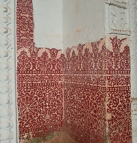
Kaavi Art on Church intrados, Old Goa
image courtesy: buildgrounded.com
Kaavi Art on Church interiors, Old Goa
image courtesy: buildgrounded.com


Kaavi art restoration at Vargao Temple, Bicholim
Self Documented
Pigment using Soil
My experimentation with pigments expanded beyond soil. I used Indian berries, grinding them to produce color, initially as experiments rather than a fully formed concept. Yet, these materials carried personal and cultural memories, tying my childhood and heritage into the work.
I experimented with Laking with jamun (Indian berries), Oil paint from soil, Water-based pigments from ground soil, Pigments from oxides, Woad pigment extraction (blue).
Each experiment became a ritual with process and material reflecting time, presence, and memory.
After my research on Kaavi motifs and soil in the previous unit, this time I attempted to create oil paint using laterite soil from Goa and, after several experiments, was able to achieve a successful result. I also wanted to recreate the traditional method once used for making Kaavi motifs, combining soil, jaggery (a sugarcane extract), powdered burnt shells, and lime gypsum to form a thick paste. Due to the unavailability of powdered shells, I used a small amount of dispersion as a binder for the pigment. After several trials, this process proved successful, and I plan to use this pigment in my Research Festival work.
One noticeable change I observed during these experiments was how drastically the colour of the soil changed, reacting differently each time. During my MA Show, the paint I created had a much stronger reddish hue, whereas recreating it this time resulted in a deeper burnt sienna or dark-brown tone.
Working with these earthy, brown pigments also connected my practice to a rhythm of labour and meditation (labor et ora; Cotnoir, 2021), where the process itself became as meaningful as the outcome.
The materiality of the pigments , the smell of soil, the texture under my fingers, the way the powder settled or reacted with oil became a form of reflection and grounding, embedded in the spaces I inhabited and observed.The use of brown pigments also reminded me of alchemical processes, starting with something raw, even unpleasant or formless, and transforming it into something meaningful. Brown pigments, historically dismissed as “earth tones” or “brown sauce,” have long been tied to ideas of squalor and decay, what alchemists called the materia prima, the fetid earth from which transformation begins. I found resonance in this: how something so basic, even dirty, could hold the potential for beauty and reflection. The heaviness of soil and its association with labour, the mundane, the discarded, mirrored my own state of mind during transitions and reflections on space.

Mulling laterite soil in oil paint

Mulling laterite soil mixed with jaggery (sugarcane extract),gypsum and dispersion in water based paint


Oil Pigment on canvas

painting from first oil paint experiment
Oil paint created from pure laterite soil
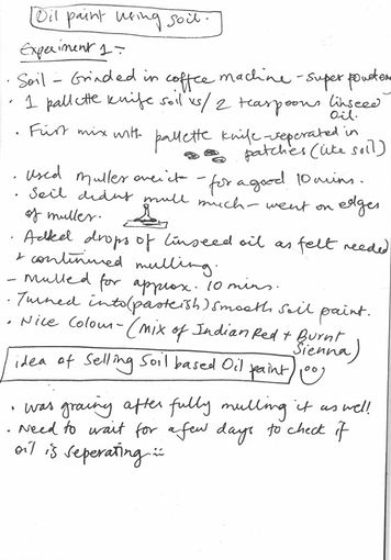
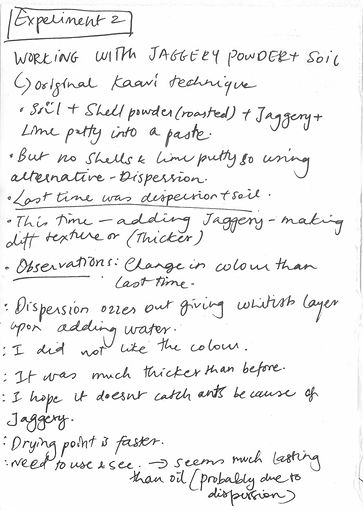
Studio notes of experiments- Oil paint using soil and working with soil and jaggery powder
While researching brown pigments,I was fascinated when i discovered mummy brown. Mummy brown is a pigment made not by grinding gemstones but Egyptian mummies. It became popular during the 16th century, when traders constructed a well-oiled network for trafficking mummies into Europe. Human mummies yielded the best pigment, though in their absence, artists also used mummified cats buried alongside their Egyptian owners. The pigment was valued by Renaissance painters as well as the Pre-Raphaelites, who, despite rejecting classical idealization, shared a fascination with its transparency. It worked beautifully for glazing canvases and painting shadows and flesh tones. I became fascinated not only by the historical use of brown pigments but also by the way artists like Rubens and Rembrandt manipulated them. This feeling of literally having a corpse on a canvas and depicting scenes of wars and truimphs left a startled feeling in me.
Inspired by this, I visited the Rembrandt House Museum to study his use of pigments.
Observing Rembrandt’s works, I became fascinated by the very dark, rich browns he achieved, often referred to as Vandyke brown or Cassel earth, an earth pigment sourced from Northern Europe, including regions close to the Netherlands.
His palette was dominated by earth tones like ochres, umbers, and deep browns, creating a dense, layered warmth inseparable from the landscapes, soils, and cultural context of his homeland (Feller, 1986). In contrast, Rubens palette leaned more towards siennas, ochres, and warmer browns, drawn from pigments sourced in Italy and Flanders, giving his works a different kind of vibrancy and luminosity.
Observing these differences, I realized that the colors an artist chooses are not merely visual decisions; they carry the geography, history, and labor of the land from which the materials are drawn.
Each stroke of earth-based pigment embodies the sediments of time and place, embedding material memory into the surface of the painting itself.
Collecting soil from my own region felt like the same process, a strong representation of my work and the layered experiences of human presence upon it. This reinforced my interest in connecting pigment to land, memory, and human presence, showing how deeply place can shape both color and meaning.
Dark Vandyke brown
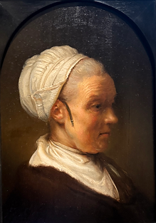
Study of an Elderly Woman in a White Cap (1640), Rembrandt at Rembrandthuis, Amsterdam

Mummy brown; image courtesy: ArtUK.org

The Holy family at Night, Rembrandt at Rembrandthuis, Amsterdam
To closely observe Rubens’ technique, I went to The National Gallery, where I studied his use of a brown wash as a base before layering thicker pigments to build depth and warmth.
Inspired by this, I began experimenting with my own handmade pigments, painting his works in the gallery and layering them in to explore the qualities of the pigment. It was quite different to the ways of how i usually paint but i began to feel like a repetition of a historical event, as Ruben, who often lived in different parts of Europe, worked with various shades of brown influenced by his geographical location and the earth of the land.
Painting these scenes made me feel that I was adding a small part of my own land into this shared emotion.The process of grinding soil, creating pigments, and applying them became almost ritualistic, echoing the layering of memory and presence in spaces I had been exploring.
In both cases, layering became a method of connecting the material to human experience: each stroke, each wash, carrying time, memory, and emotion.
His underpainting colors are simple, an imprimatura with an earth pigment between yellow ochre and raw Sienna. Sometimes he used a gray imprimatura. This was streaked on the ground in a pattern, sometimes horizontally, sometimes diagonally from the top right corner to the bottom left corner, and sometimes vertically. Then his underpainting colors were slightly darker, composed of raw Sienna, burnt Sienna, burnt umber, and black. Occasionally, I have made the last color white to set the stage for the mass tone.
Paintings from The National Gallery


Closeup of A Lion Hunt (1614-15), Peter Paul Rubens at The National Gallery, London

Closeup of Samson and Delilah (1609-10), Peter Paul Rubens at The National Gallery, London

Pigment study notes

Painting with soil pigment at The National Gallery

Mulling the soil pigment: water based; laterite soil, oxide and dispersion
Laking and Calcinating experiments: Indian Berries and Kokum


WOAD Extraction
Woad extraction was a workshop I attended as part of the Painting Methods and Materials sessions. In the previous unit, we had cultivated woad plants in the garden, and now, with them fully grown, we experimented with extracting blue pigment from their leaves. The results were a rich, navy-blue colour pigment.
Process:
-
Wash the leaves plucked from the woad plant and crush them lightly.
-
Place the leaves in a vessel and boil at 80°C for 10 minutes.
-
After boiling, transfer the vessel to an ice bucket and let it cool for 5 minutes, until the temperature reaches around 50°C.
-
Squeeze out the leaves from the boiled mixture and add 3 tablespoons of soda ash or potash. This addition causes the extract to change color.
-
Foam the mixture by pouring it from one bucket to another for about 10 minutes. The foam should gradually turn blue.
-
Allow the extract to rest for 2 days, then repeatedly clean it with water until the liquid becomes clear.

workshop notes

Woad leaves

extract sifting to enhance colour

leaves boiling at 80 degrees

Blue foam

ice bath at 50 degrees

final extracted pigment (left) and pigment cleaning in process ( right)
From studying Rubens’ paintings and exploring pigment extraction to working with Kaavi pigments in Goa, my research gradually evolved toward understanding the influence of Portuguese colonization which naturally drew me to the color blue.
I learned that blue pigments were historically prized by French and Portuguese rulers, who used them to adorn palaces and churches through glazing and tile techniques. This practice resonated deeply with me, especially given the enduring Portuguese presence in Goa. The Azulejos; the iconic blue-glazed ceramic tiles introduced during Portuguese rule became a point of fascination. Still visible today on Goan house facades and nameplates, they act as markers of identity, history, and continuity, bearing witness to generations that have inhabited the same spaces.

Azulejos, image courtesy: amritaduorah.com
Delving deeper, I discovered that the blue pigments used in Portuguese tile-making carried vast material and trade histories. The story of Portuguese blue unfolds like a journey across lands and centuries, from the cobalt mines of Saxony and Bohemia in the 16th century to the luminous faience and azulejos that adorned churches, palaces, and public buildings. By the 19th century, Portuguese technical literature recorded both natural and synthetic blues, revealing the interplay between experimentation, craft, and industrial innovation (de Oliveira et al., 2019). When these pigments reached Goa, they embedded themselves in its architecture and cultural fabric, a tangible link between colonial histories, local craftsmanship, and present-day Goan identity.


Azulejos on Chapel, Saint John the Baptist,Goa.
My fascination deepened further when I encountered Haint Blue through Anna Bunting Branch, a shade rooted in African traditions that later traveled to Louisiana. More than a colour, it spoke of trade, labour, and displacement, a pigment shaped by movement and memory. Reflecting on this, I found myself returning to the browns of my own land: the earthy reds of Kaavi, the siennas of Europe, the soils of Goa. Each pigment carried its own geography, its own rhythm of labor and belonging.
This comparative reflection reinforced my own practice. Just as historical blues and browns hold stories of place, exchange, and endurance, the pigments I create from soil, berries, and other local materials embody layers of memory, personal history, and the materiality of space. The earth I grind, the textures I build, and the surfaces I work upon are not merely materials, they are conduits of experience, quietly binding the past and present through color, labor, and touch.
Reading notes on blue pigment
Citations
-
Feller, Robert L. (ed.). Artists’ Pigments: A Handbook of Their History and Characteristics – Volume 1.Washington DC: National Gallery of Art / Cambridge University Press, 1986.
-
Designboom, 2021. Thierry Mandon – Inside–Outside [online] 14 September. Available at: https://www.designboom.com/art/thierry-mandon-inside-outside-france-09-14-2021/ [Accessed 10 October 2025]
-
Jackson’s Art. “Van Dyck Brown | Pigment Stories.” Jackson’s Art, [online] Available at: https://www.jacksonsart.com/colour/pigments-powders/pigment-stories/brown/van-dyck-brown [Accessed 5 October 2025]
-
Elkins, J., 1999. What Painting Is: How to Think about Oil Painting, Using the Language of Alchemy. New York: Routledge, p.45, 54,126.
-
Ringling Docents. “Rubens Colour Palette.” [online] Available at: https://www.ringlingdocents.org/pages/rubens-colors.htm [Accessed 10 July 2025].
-
Freed, K., 2013. Working in Rubens’ Painting Technique. Natural Pigments. Available at: https://www.naturalpigments.eu/artist-materials/rubens-painting-technique [Accessed 5 October 2025]
-
Ashmolean Museum, n.d. Collections Online – Ashmolean Museum. Available at: https://www.ashmolean.org/collections-online#/item/ash-object-373494 [Accessed 2 October 2025]
-
Conversations with Anna Bunting Branch, 1-2-1 tutorial
-
Brinkhof, T., 2022. Artists used to grind down mummies to make brown paint. Big Think. Available at: https://www.bigthink.com/high-culture/pigment-mummy-brown-paint/ [Accessed 15 October 2025]
-
Barros dos Santos, S. and Cruz, A. J., 2019. Green traditional pigments and modern synthetic pigments in nineteenth-century Portuguese technical literature. YOCOCU Conference Proceedings. Available at: https://www.yococu.com/wp-content/uploads/2022/10/FINALE.pdf [Accessed 25th October 2025].
-
Herald Goa, 2025. The Enduring Legacy of Azulejos: From Portugal to Goa’s Cultural Tapestry. The Herald Goa, 3 Nov 2025. Available at: https://www.heraldgoa.in/cafe/the-enduring-legacy-of-azulejos-from-portugal-to-goas-cultural-tapestry/9435/ [Accessed 23 July 2025].
-
Low, S.M. and Lawrence-Zúñiga, D. (eds.) (2003) The Anthropology of Space and Place: Locating Culture. Oxford: Blackwell Publishing.
-
Massey, D. (2005) For Space. London: SAGE Publications Ltd, p.172-196.
-
Conversations with Geraint Evans.
-
Ball, P., 2001. Bright Earth: Art and the Invention of Colour. London: Penguin Books.
-
Tuan, Y.-F. (1977) Space and Place: The Perspective of Experience. Minneapolis: University of Minnesota Press, p.6-10.
-
Chemould Prescott Road (Gallery), 2021. Tallur LN, Interference, 2019. 4k Video, television monitors, duration: 4.00 min. Available at: https://www.gallerychemould.com/artworks/3554‑tallur‑ln‑interference‑2019/ [Accessed 30 August 2025].
-
WebExhibits, 2015. Pigments through the Ages – Renaissance & Baroque (1400‑1600). Available at: https://www.webexhibits.org/pigments/intro/renaissance.html [Accessed 2 October 2025].
-
Learning Mojo, 2015. Research point: Coloured ground for oil paints. [blog] 7 May. Available at: https://learningmojo.wordpress.com/2015/05/07/research-point-coloured-ground-for-oil-paints/ [Accessed 15 October 2025].
-
S.B. & Cruz, A.J., 2009. ‘Traditional and modern blue pigments in Portuguese technical literature’, Youth in Conservation of Cultural Heritage, p.44‑50.
-
Goyal, A., 2015. Azulejos – Charming Hand‑Painted Tiles of Goa. [online] IndiTales. Available at: https://inditales.com/azulejos-hand-painted-tiles-goa/ [Accessed 18 october 2025].
-
Cotnoir, D., 2021. The Alchemy of Paint: Art, Science and Secrets from the Middle Ages,Labor et Ora, London: Thames & Hudson, p.32